 Photo by Manik Rathee on Unsplash
In the Simple and Multiple Linear Regression, we saw the various metrics that we can use to validate our model. A high R-squared value and F statistics with low p-value generally indicates a good model. But its possible that the relationship between the dependent and the independent variables is not linear. We may have to include a quadratic term or a log transformation or we ma have left out an important variable.
We can use the regression plots to discover more about our model and have a look at the residuals to see if there are any trends or patterns in their distributions.
1. Residual vs Fitted Plot
It is a scatter plot of the residuals on the y axis and fitted or the predicted values on the x axis. This is a very important plot and is useful in detecting non-linearity, unequal error variances, and outliers.
- A good residual vs fitted plot will have the following characteristics
- The residuals “bounce randomly” around the 0 line. This suggests that the assumption that the relationship is linear is reasonable.
- The residuals roughly form a “horizontal band” around the 0 line. This suggests that the variances of the error terms are equal.
- No one residual “stands out” from the basic random pattern of residuals. This suggests that there are no outliers.
- The residual vs fitted plot for our model shows that
- Even though there is not a distinct pattern in the distribution of the residuals, we can see that there are more residuals below the 0 line
- The Scatterplot smoother Red line that shows the average value of the residuals at each value of fitted value is not perfectly flat.
- There are outliers that may need further investigation. We have highlighted 6 outliers using the id.n parameter
lm.fit <- lm(mpg~wt+qsec+drat, data = mtcars)
plot(lm.fit, which = 1,id.n = 6)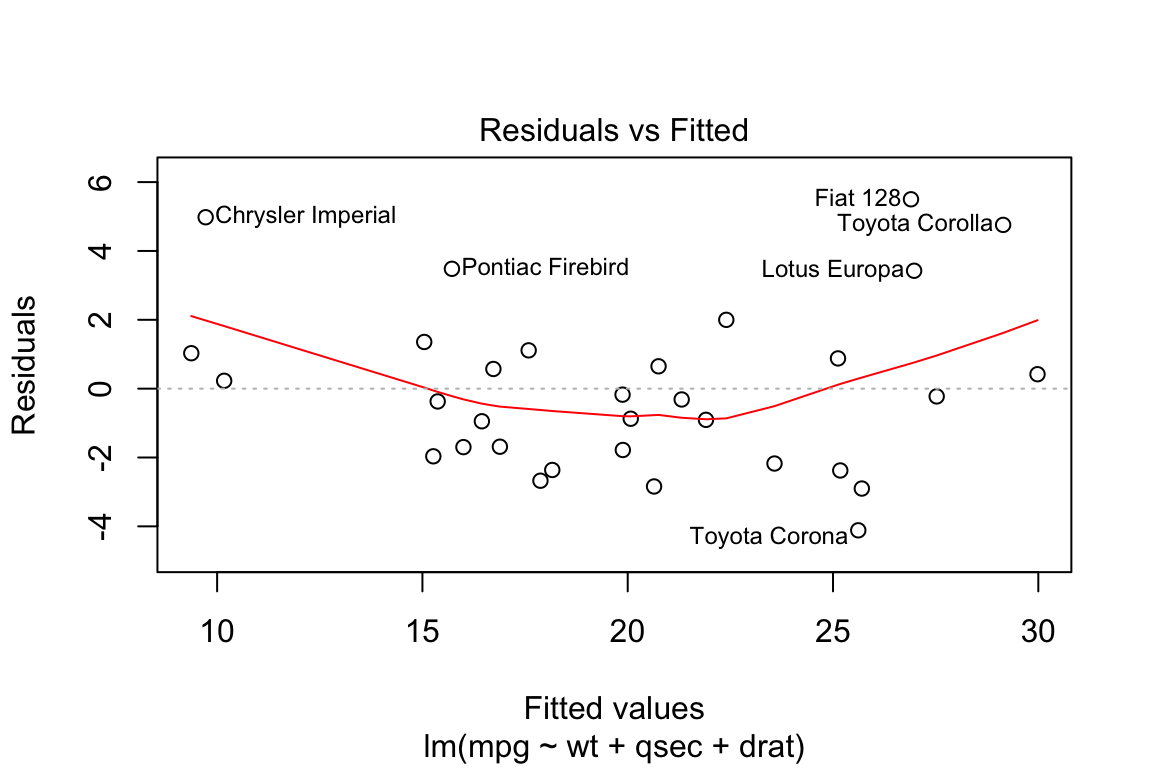
Lets try removing these 6 outliers from our data and see if it has any impact. Even though the plot hasn’t changed much we can see that the R-squared has improved from 83% to 91%
lm.fit <- lm(mpg~wt+qsec+drat, data = mtcars)
summary(lm.fit)$r.squared
## [1] 0.8370214remove_outliers <- c("Chrysler Imperial", "Pontiac Firebird", "Fiat 128",
"Toyota Corolla","Lotus Europa", "Toyota Corona")
lm.fit <- lm(mpg~wt+qsec+drat,
data = mtcars[!rownames(mtcars) %in% remove_outliers,])
plot(lm.fit, which = 1)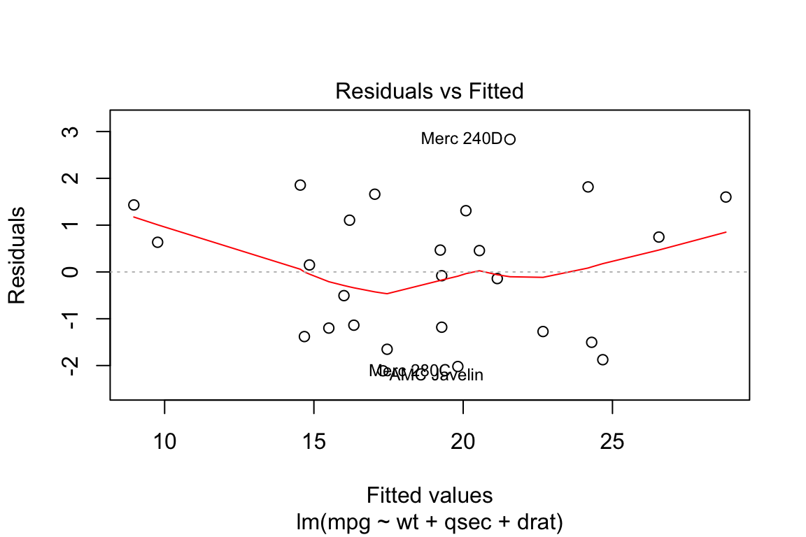
summary(lm.fit)$r.squared## [1] 0.91523882. Normal Q-Q plot
This plot shows if residuals are normally distributed. Do residuals follow a straight line well or do they deviate severely? It’s good if residuals are lined well on the straight dashed line. In particular, if the residual tend to be larger in magnitude than what we would expect from the normal distribution, then our p-values and confidence intervals may be too optimisitic. i.e., we may fail to adequately account for the full variability of the data.
plot(lm.fit, which = 2)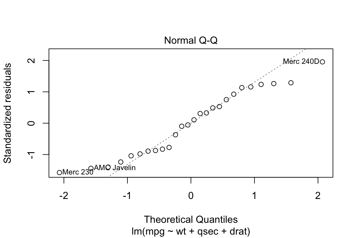
3. Scale-Location
It’s also called Spread-Location plot. This plot shows if residuals are spread equally along the ranges of predictors. This is how you can check the assumption of equal variance (homoscedasticity). It’s good if you see a horizontal line with equally (randomly) spread points.
plot(lm.fit, which = 3)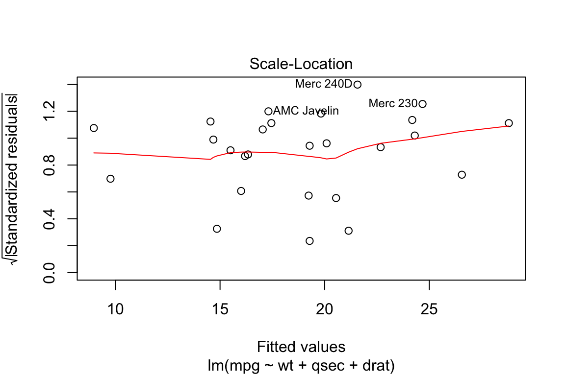
4. Cooks Distance
In regression, cook’s distance is a measure of influence of a single observation on the predicted dependent variable. The higher the value the more influence a particular observation plays in the overall model fit.
As a cut off of influence, we use the value of four divided by the degrees of freedom in the multiple regression model.
lm.fit <- lm(mpg~wt+qsec+drat, data = mtcars)
plot(lm.fit, which = 4, cook.levels = 4/ lm.fit$df)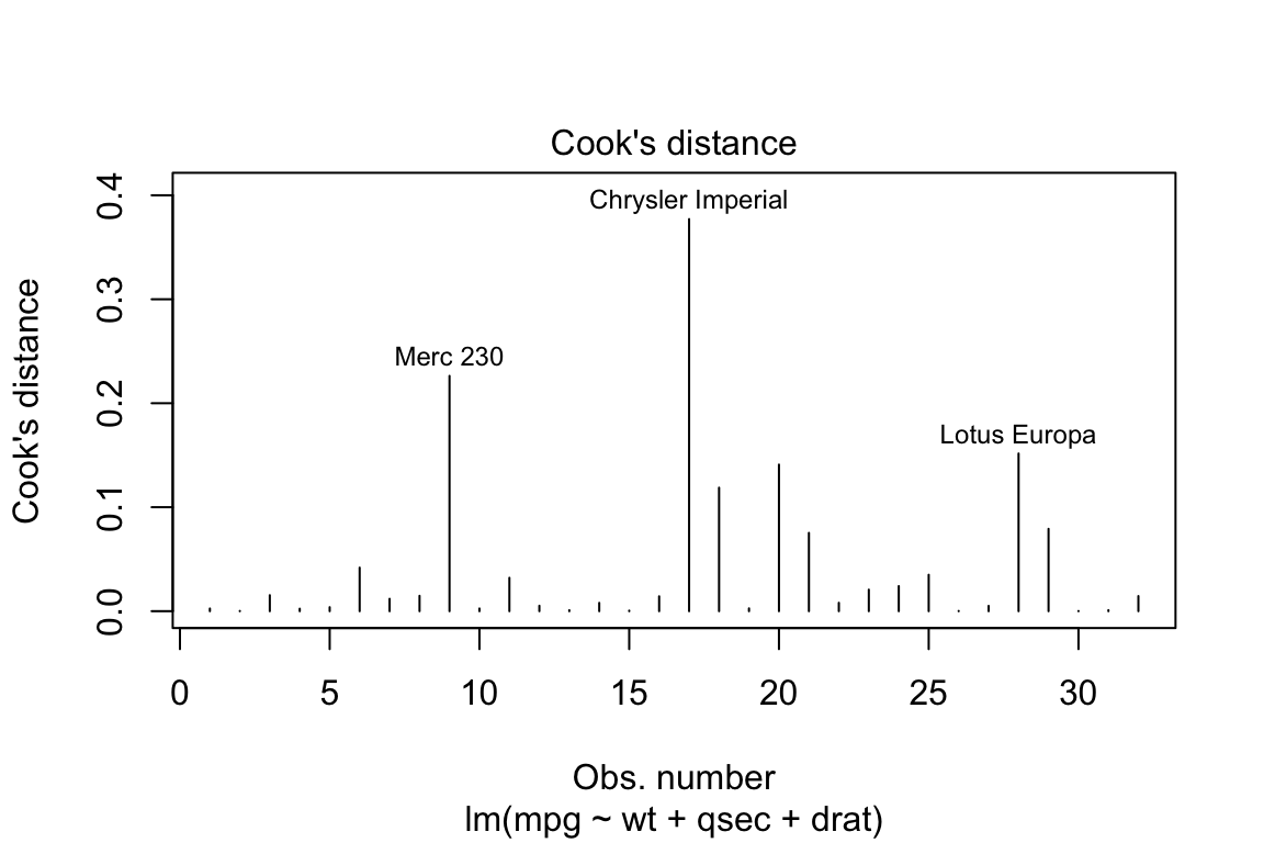
5. Residuals vs Leverage
We can see that all the cases are within the Cook’s distance (Red) lines suggesting there are no influential cases.
lm.fit <- lm(mpg~wt+qsec+drat, data = mtcars)
plot(lm.fit, which = 5)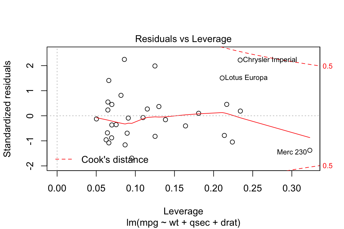
6. Cooks distance vs Leverage
plot(lm.fit, which = 6)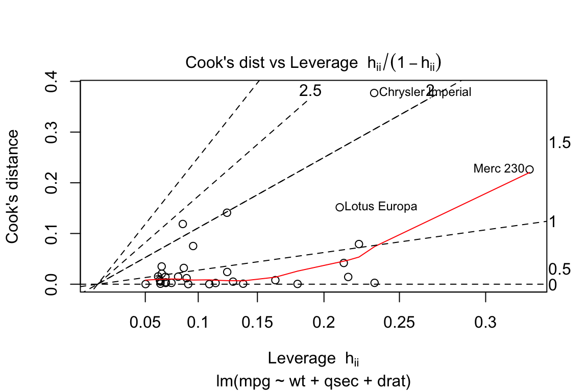
Summary
This post is Work in Progress