- Data description
- Missing values
- Basic imputation
- Binary Features
- Categorical features
- Remaining features
- Do the features follow a normal distribution ?
- Correlation
- Binary-Binary Correlation (Phi Coefficient)
- Binary-Binary Correlation (Chi-Square test / CramerV)
- Continuous - Binary (Kruskal-Wallis Rank Sum Test)
- Summary / Key Learnings
 Photo by Viraj Rajankar on Unsplash
Porto Seguro is Brazilian insurance company. They hosted a Kaggle competition in Nov 2017 to predict the probability that a driver will initiate an auto insurance claim in the next year. This was the first Kaggle competition that I participated. In this post, I will do an exploratory analysis of the training data and also try some statistical inference tests.
Data description
The training set has around 600k observations and 59 features (including the target feature and an id feature) and test set has around 900K rows. Below was the given description :
#train file stored outside the blog files
root <- '/Mac Backup/R-Large-Items/porto/'
DT_train <- fread(file=paste(root,'train.csv',sep=''))
DT_test <- fread(file=paste(root,'test.csv',sep=''))
# dim(DT_train)
# dim(DT_test)
In the train and test data, features that belong to similar groupings are tagged as such in the feature names (e.g., ind, reg, car, calc). In addition, feature names include the postfix bin to indicate binary features and cat to indicate categorical features. Features without these designations are either continuous or ordinal. Values of -1 indicate that the feature was missing from the observation. The target columns signifies whether or not a claim was filed for that policy holder.
Missing values
- The first thing that I look at in a dataset is whether there are any missing values.
- The missing value and its imputation is a interesting topic that I am hoping to cover in the future. I have used the
plot_missingfrom the excellentDataExplorerpackage to get an idea of the missing values. - The missing values were coded as -1 that I have converted to NA and I am plotting only the features that had missing values.
- There are 13 features with missing values and four of them (
ps_car_14,ps_reg_03,ps_car_05_catandps_car_03_cat) have significant volume of missingness - The distribution of the missing values is shown in the following plot
DT_train[DT_train == -1] <- NA
#lapply(DT_train,function(x) sum(is.na(x))/length(x))
cols_NA <- names(which(lapply(DT_train,function(x) sum(is.na(x))/length(x)) >0))
DataExplorer::plot_missing(DT_train[,..cols_NA]
                           ,theme_config = theme_darklightmix(color_theme = ggplot_color_theme)
,title = "Missing values") 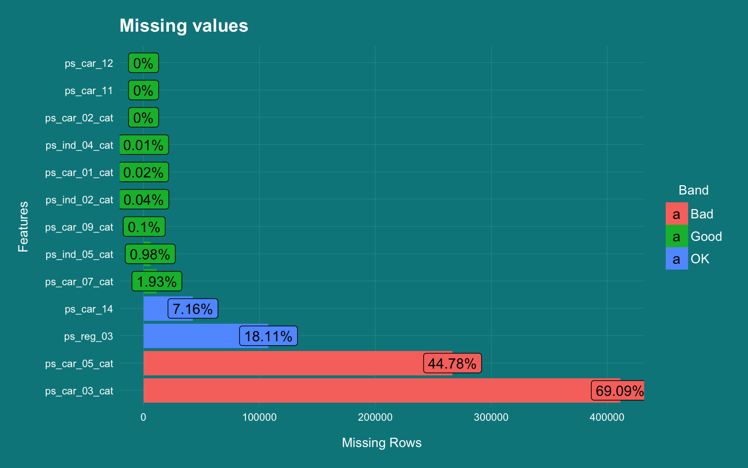
visdat::vis_dat(dplyr::sample_n(DT_train[,..cols_NA],60000),warn_large_data = F)  +
  theme_darklightmix(color_theme = ggplot_color_theme,legend_position = "right") +
  labs(title="Missing value distribution (sample size 60K)"
  ,caption = varPlotCaption) +
        theme(axis.text.x = element_text(angle =45,hjust=0.2))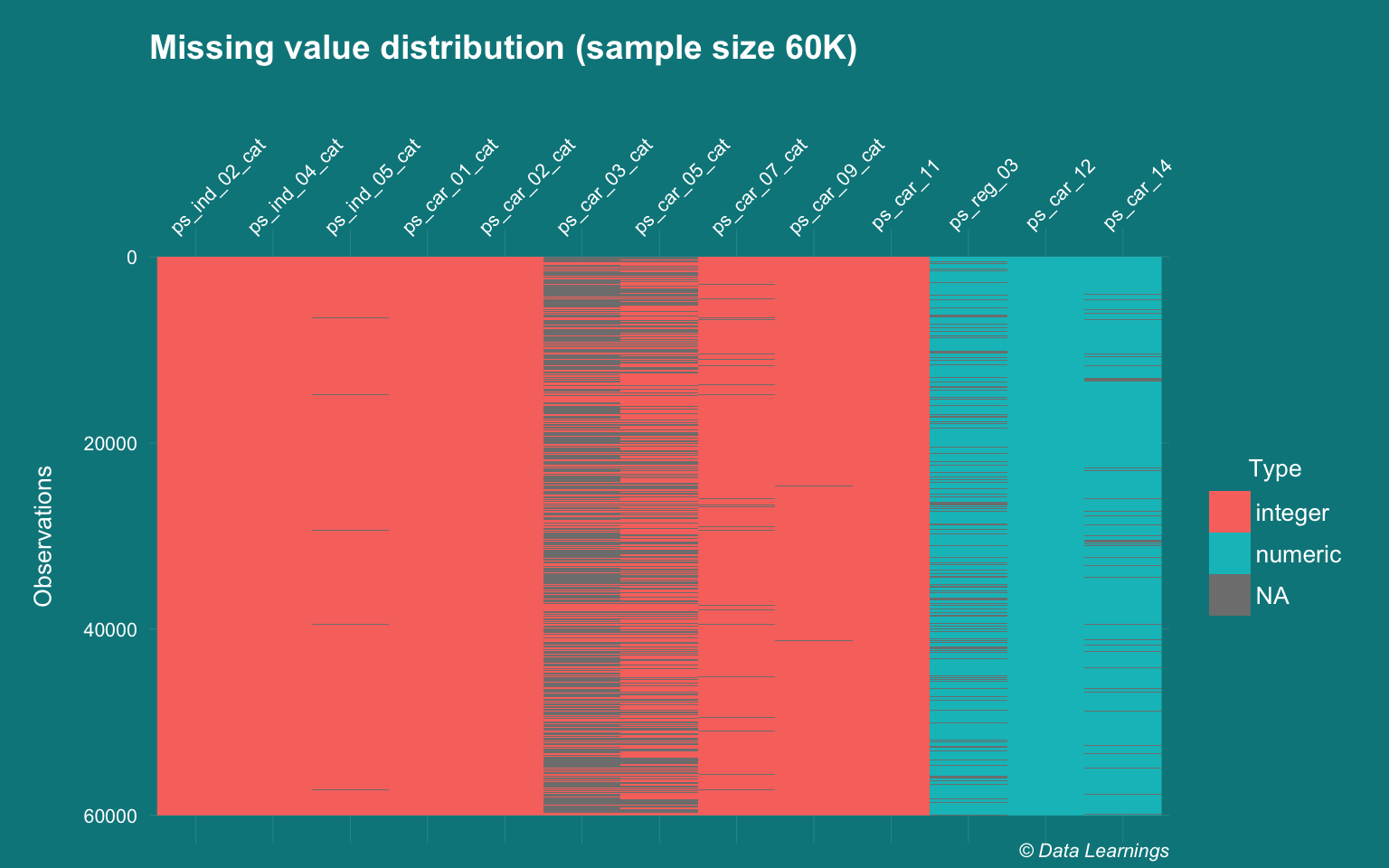
Basic imputation
- Missing value imputation is an extensive topic and there are many advanced algorithms and packages like mice, Amelia, expectation maximisation etc. that can be used
- But for this analysis, I will rely on the simplest methods :
- Mode imputation for categorical features
- Median imputation for the continuous features.
- I could have handcoded the functions but they are available in the
na.toolspackage
DataExplorer::plot_histogram(DT_train[,..cols_NA]
                           ,theme_config = theme_darklightmix(color_theme = ggplot_color_theme)
,title = "Distribution of the features with missing values") 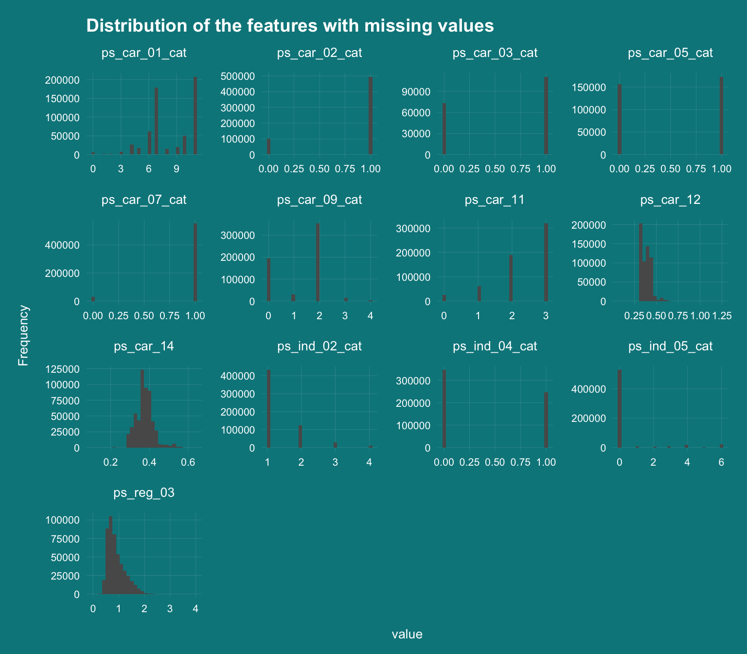
cols_NA_cat <- c("ps_ind_02_cat","ps_ind_04_cat","ps_ind_05_cat","ps_car_01_cat","ps_car_02_cat","ps_car_03_cat","ps_car_05_cat","ps_car_07_cat","ps_car_09_cat","ps_car_11")
DT_train[,(cols_NA_cat) := lapply(.SD,na.tools::na.most_freq), .SDcols = cols_NA_cat ]

cols_NA_cont <- c("ps_car_14","ps_reg_03","ps_car_12")
DT_train[,(cols_NA_cont) := lapply(.SD,na.tools::na.median), .SDcols = cols_NA_cont ]
Binary Features
- There are 17 features that are postfixed with ‘bin’. These are binary features and as such have values of 0 and 1.
- 99% of observations have zero values for the features
ps_ind_10, ps_ind_11, ps_ind_12 and ps_ind_13. For the predictive modeling, these features would not add much values and I would probably look at dropping them.
cols_bin <- grep("bin",names(DT_train),value = T)

DT_train[,..cols_bin] %>%
  melt(measure.vars = 1:ncol(.)) %>%
  .[,.(freq=.N),.(variable,value)] %>%
  .[,.(value,freq,freqPct=freq/sum(freq)),variable] %>%
  ggplot(aes(x=factor(value),y=freq/1e3,fill=factor(value))) +
  geom_col() +
  facet_wrap(~variable,scales="free",ncol=3) +
  scale_y_continuous(labels = scales::unit_format(unit = "K")) +
#  scale_x_discrete(breaks = c(0,1)) +
  geom_text(aes(label = paste(round(100*freqPct,1),"%",sep="")), position = position_stack(vjust = 0.5), size = 2) +
  theme_darklightmix(color_theme = ggplot_color_theme,legend_position = "none") +
  scale_fill_brewer(palette = "Set3") +
  labs(x="value"
  ,y="count"
  ,title="Distribution of bin variables"
  ,caption = varPlotCaption)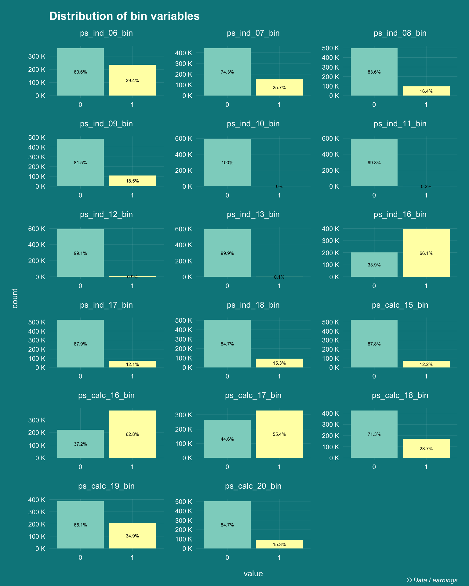
Categorical features
- There are 14 features that are postfixed with cat. These are categorical features.
- While majority of them have less than 10 levels, there are some features like
ps_ind_06_catandps_car_11_catthat have higher number of levels.- As these are column plots, the variability is not clear, so I will include
ps_car_11_catin the following histogram plots
- As these are column plots, the variability is not clear, so I will include
cols_cat <- grep("cat",names(DT_train),value = T)

DT_train[,..cols_cat] %>%
  melt(measure.vars = 1:ncol(.)) %>%
  .[,.(freq=.N),.(variable,value)] %>%
  .[,.(value,freq,freqPct=freq/sum(freq,na.rm = T)),variable] %>%
  ggplot(aes(x=factor(value),y=freq/1e3,fill=factor(..x..))) +
  geom_col() +
  facet_wrap(~variable,scales="free",ncol=3) +
  scale_y_continuous(labels = scales::unit_format(unit = "K")) +
#  scale_x_discrete(breaks = c(0,1)) +
  geom_text(aes(label = paste(round(100*freqPct,1),"%",sep="")), position = position_stack(vjust = 0.5), size = 2) +
  theme_darklightmix(color_theme = ggplot_color_theme,legend_position = "none") +
  scale_fill_brewer(palette = "Set3") +
  labs(x="value"
  ,y="count"
  ,title="Distribution of cat variables"
  ,caption = varPlotCaption)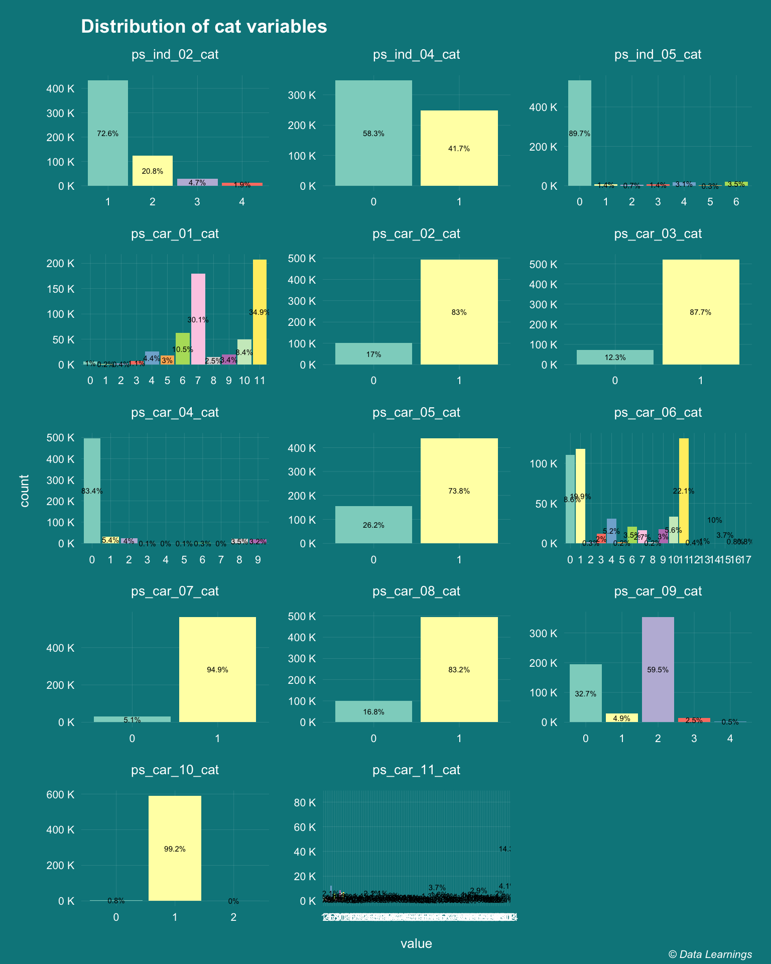
Remaining features
Remaining 26 features are either continuous or ordinal are have been plotted below
#remove id and target and add one variable from cat
cols_others <- names(DT_train)[!names(DT_train) %in% c(cols_bin,cols_cat,"id","target")]
cols_others <- c(cols_others,"ps_car_11_cat")
fn_extraPolate <- colorRampPalette(brewer.pal(6, "Set3"))

DT_train[,..cols_others] %>%
  melt(measure.vars = 1:ncol(.)) %>%
  ggplot(aes(x=value,y=..count../1e3,fill=variable)) +
  geom_histogram(na.rm = T) +
  facet_wrap(~variable,scales="free",ncol=3) +
  scale_y_continuous(labels = scales::unit_format(unit = "K")) +
#  scale_x_discrete(breaks = c(0,1)) +
  theme_darklightmix(color_theme = ggplot_color_theme,legend_position = "none") +
#  scale_fill_continuous()
  scale_fill_manual(values = fn_extraPolate(length(cols_others))) +
#  scale_fill_brewer(palette = "Set3") +
  labs(x="value"
  ,y="count"
  ,title="Distribution of remaining variables"
  ,caption = varPlotCaption)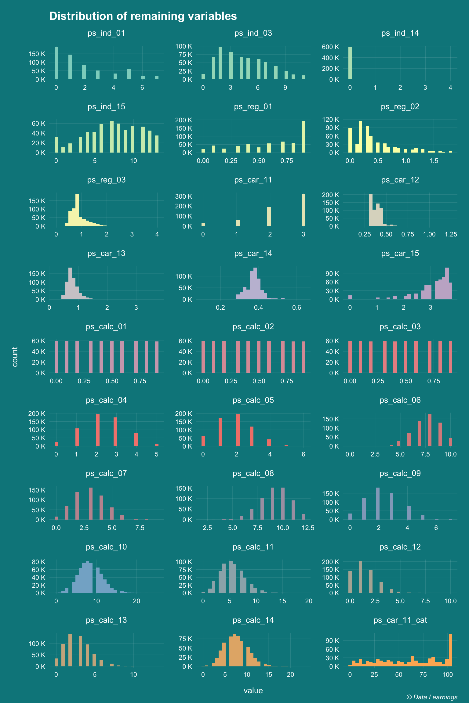
Do the features follow a normal distribution ?
- Some of the prediction algorithms require the continuous features to follow a normal distribution. This can be verified by different ways :
- Histogram
- QQ Plots
- Shapiro-Wilk Test
- Kolmogorov-Smirnov Test
- Anderson-Darling test
- We already know that the binary and categorical features do not follow normal distribution.
- Let’s look at few of the features that looked like normally distributed in the histograms (plotted above)
- Only
ps_calc_10,ps_calc_14and to certain extentps_calc_11shows clear normal distribution ps_reg_03,ps_car_14andps_car_13(not shown) is influenced by outliers and will need to be treated
- Only
cols_others_normal <- c("ps_ind_03", "ps_ind_15", "ps_reg_03","ps_car_14", "ps_car_15", "ps_calc_06", "ps_calc_10", "ps_calc_11", "ps_calc_14")

DT_train[1:100,..cols_others_normal] %>%
  melt(measure.vars = 1:ncol(.)) %>%
  ggplot(aes(sample = value,color = variable)) +
  stat_qq() +
  stat_qq_line() +
  facet_wrap(~variable, scales = "free", ncol = 3) +
  theme_darklightmix(color_theme = ggplot_color_theme,legend_position = "none") +
  scale_color_manual(values = fn_extraPolate(length(cols_others_normal))) +
  labs(x="value"
  ,y="count"
  ,title="QQ Plots - Normality Testing"
  ,caption = varPlotCaption)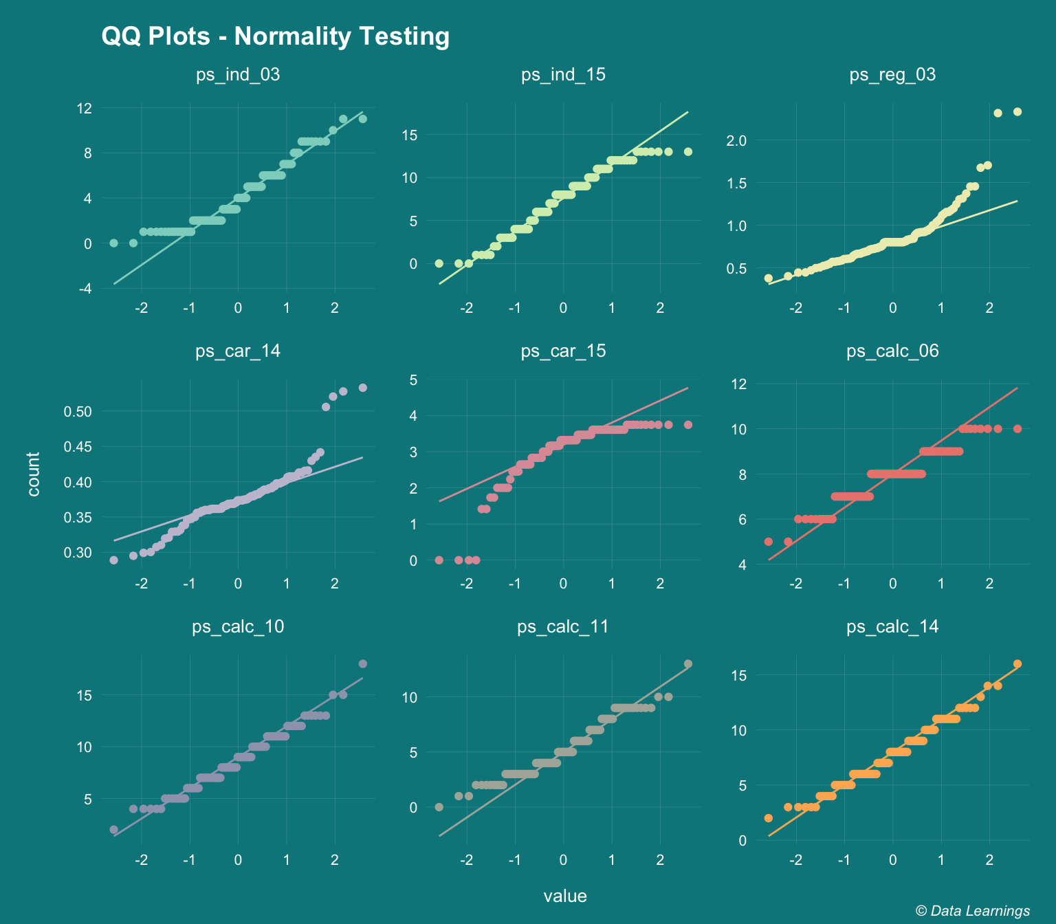
How about using statistical tests for normality
- There are couple of them :Shapiro-Wilk and Kolmogorov-Smirnov Test
- The null hypothesis for these tests is that the distribution is normal
- Hence a p-value << 0.05 means would reject the null hypothesis
- From the below table we can see that none of the features are normal
- This might not be 100% correct as these tests don’t work well for large datasets
- And they expect the distribution to be perfectly normal
shap <-  DT_train[,lapply(.SD,function(x) shapiro.test(sample(x,5000))$p.value)
         ,.SDcols = cols_others_normal] %>% melt(value.name ="Shapiro pValue")

ks <-  DT_train[,lapply(.SD,function(x) ks.test(x,rnorm,3)$p.value)
         ,.SDcols = cols_others_normal] %>% melt(value.name ="KS pValue")

batchtools::ijoin(shap,ks,by="variable") %>% fn_kable()| variable | Shapiro pValue | KS pValue |
|---|---|---|
| ps_ind_03 | 0 | 0 |
| ps_ind_15 | 0 | 0 |
| ps_reg_03 | 0 | 0 |
| ps_car_14 | 0 | 0 |
| ps_car_15 | 0 | 0 |
| ps_calc_06 | 0 | 0 |
| ps_calc_10 | 0 | 0 |
| ps_calc_11 | 0 | 0 |
| ps_calc_14 | 0 | 0 |
Correlation
- I have used R
corfunction to see if there is correlation among the features and it does not look like there is not much.- Except for
ps_ind_12_binandps_ind_14has a high correlation coefficient of 0.89 - This gives a nice overall picture of the feature space, even though it violates some of the assumptions of Pearson correlation i.e. normality, linearity and homoscedasticity.
- Except for
correl <- cor(DT_train,method="pearson")

ggcorrplot::ggcorrplot(correl, hc.order = FALSE, type = "lower",lab=F,lab_size = 2,outline.color = "black") +
    labs(title="Pearson correlation of all features"
    ,caption = varPlotCaption) +
    theme_darklightmix(color_theme = ggplot_color_theme
                       ,legend_position = "bottom") +
      theme(axis.text.x = element_text(angle =90,hjust=1,vjust = 0.5)
            ,axis.title = element_blank()
            ,panel.grid.major =element_line(size=0.8)
            ,panel.grid.major.x  = element_blank())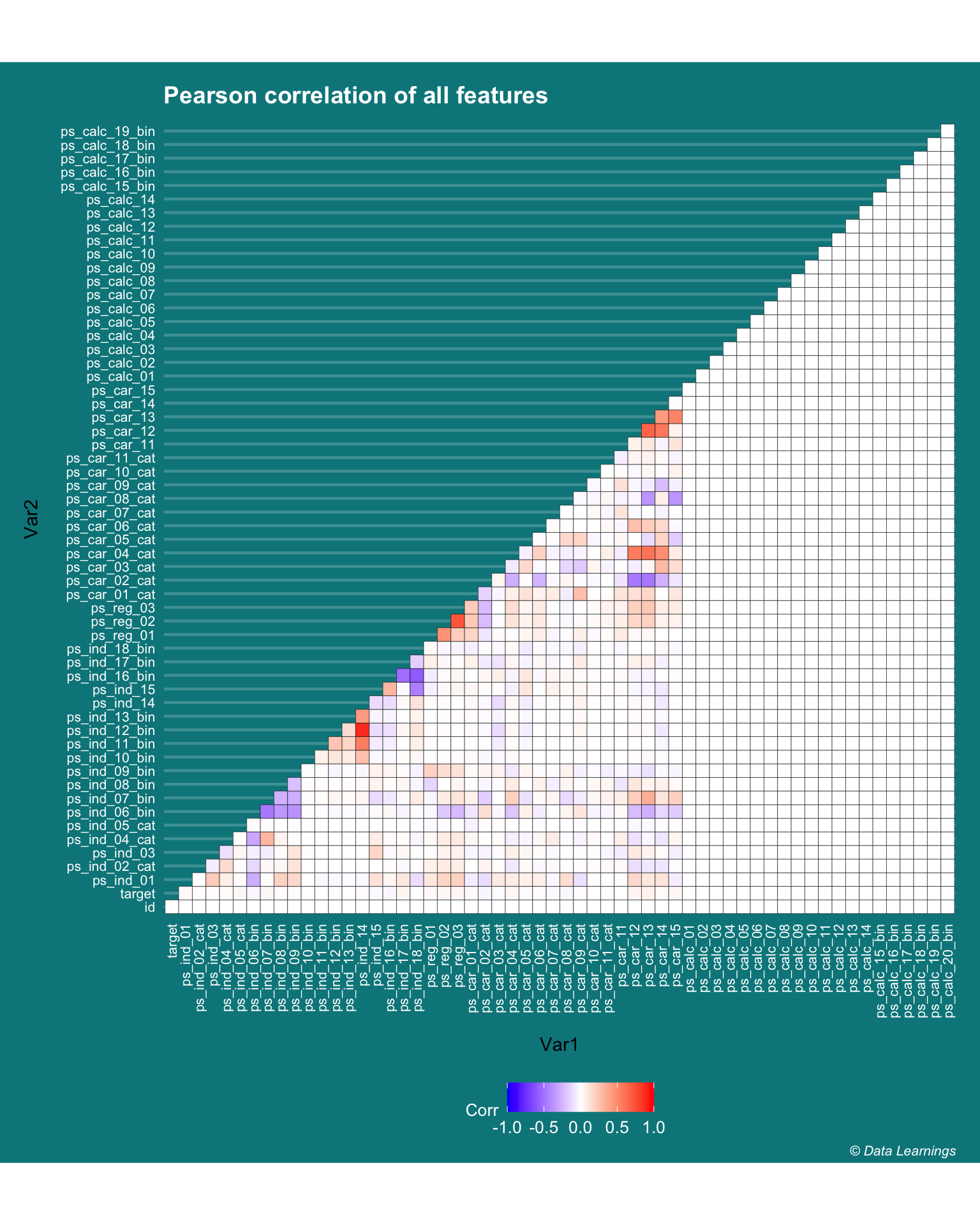
- Can the R
corfunction be used to find the correlation between different variable types i.e binary, continuous, etc ? - As per it this article it looks like there are other statistical tests available for checking the correlation or the independence of features depending on the type of variable.
- I have used the
datapastapackage to create the below table by copy pasting the values from Excel
#datapasta::tribble_paste()

cor_types  <- tibble::tribble(
                             ~Test, ~Notation,                                            ~`Variable types`,                                                          ~Assumptions,
                       "Pearson’s",     "r",                                                       "Both continuous",                           "Normality, Linearity and Homoscedasticity",
                             "Phi",     "f",                                                           "Both binary",                                                                 "TBD",
                     "Contingency",     "C",                                                      "Both categorical",                                                                 "TBD",
                  "Point-Biserial", "rpbis",                                                   "Continuous - Binary", "No outliers, Approximately normal, equal variance for each category",
                        "Biserial",  "rbis",                          "Both continuous but converted to Categorical",                                                                 "TBD",
                     "Tetrachoric",    "rt",                               "Both continuous but converted to Binary",                                                                 "TBD",
                             "Eta",     "h", "Both are continuous and are used to detect curvilinear relationships.",                                                                 "TBD",
                      "Rank Order",     "r",                                               "Both are rank (ordinal)",                                                                 "TBD"
                  )

cor_types %>% fn_kable| Test | Notation | Variable types | Assumptions |
|---|---|---|---|
| Pearson’s | r | Both continuous | Normality, Linearity and Homoscedasticity |
| Phi | f | Both binary | TBD |
| Contingency | C | Both categorical | TBD |
| Point-Biserial | rpbis | Continuous - Binary | No outliers, Approximately normal, equal variance for each category |
| Biserial | rbis | Both continuous but converted to Categorical | TBD |
| Tetrachoric | rt | Both continuous but converted to Binary | TBD |
| Eta | h | Both are continuous and are used to detect curvilinear relationships. | TBD |
| Rank Order | r | Both are rank (ordinal) | TBD |
Binary-Binary Correlation (Phi Coefficient)
- As per the above article we can use the
Phi Coefficientto determine the correlation of binary features - Is the Pearson Correlation different from the Phi Coefficient ?
- I don’t think so as I am getting the same results. Does this mean the
corfunction internally takes care of correlation of binary variable. I will need to investigate - I have used the
PairApplyfunction from theDescToolspackage for pair-wise column computations
cor <- PairApply(DT_train[,..cols_bin],FUN = cor)
p1 <- ggcorrplot::ggcorrplot(cor, hc.order = FALSE, type = "lower",lab=T,lab_size = 2,outline.color = "black"
                       ,legend.title = "p-value"
                       ,digits = 2) +
    labs(title="Correlation"
         ,subtitle =  "High indicates stronger relationship"
    ,caption = varPlotCaption) +
    theme_darklightmix(color_theme = ggplot_color_theme
                       ,legend_position = "bottom") +
      theme(axis.text.x = element_text(angle =90,hjust=1,vjust = 0.5)
            ,axis.title = element_blank()
            ,panel.grid.major =element_line(size=0.8)
            ,panel.grid.major.x  = element_blank())

phi <- PairApply(DT_train[,..cols_bin],FUN = function(x,y) psych::phi(table(x,y)))
p2 <- ggcorrplot::ggcorrplot(phi, hc.order = FALSE, type = "lower",lab=T,lab_size = 2,outline.color = "black"
                       ,legend.title = "p-value"
                       ,digits = 2) +
    labs(title="Phi Coefficient"
         ,subtitle =  "Correlation coefficient for binary variables"
    ,caption = varPlotCaption) +
    theme_darklightmix(color_theme = ggplot_color_theme
                       ,legend_position = "bottom") +
      theme(axis.text.x = element_text(angle =90,hjust=1,vjust = 0.5)
            ,axis.title = element_blank()
            ,panel.grid.major =element_line(size=0.8)
            ,panel.grid.major.x  = element_blank())


gridExtra::grid.arrange(p1, p2, ncol=2)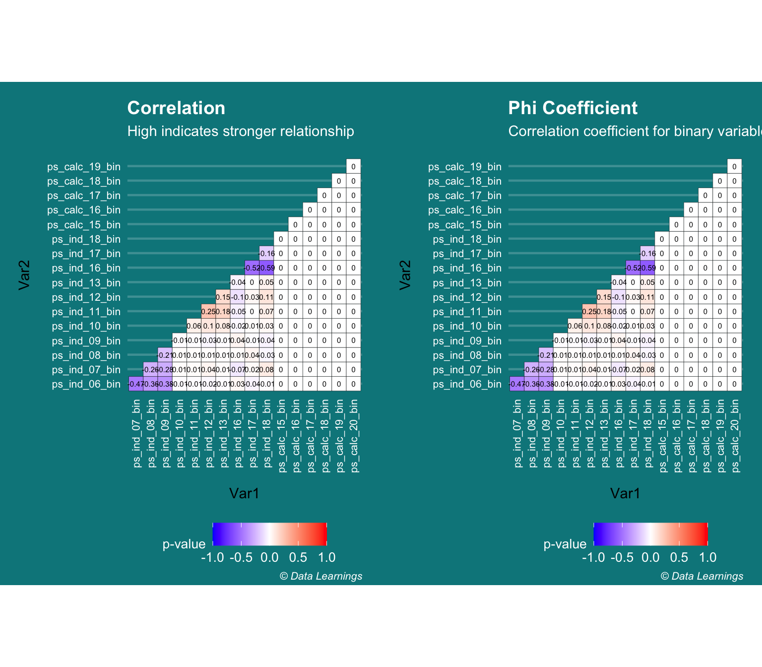
Binary-Binary Correlation (Chi-Square test / CramerV)
- Continuing with the assumption that Pearson’s correlation cannot be used for Binary features, I thought of checking the results against Chi-Square test
- Chi-square test is useful in two scenarios :
- To check if the sample comes from a population (goodness of fit test)
- To check if two categorical variables are independent
- Low chi-square implies relationship exists
- High chi-square implies no relationship
- The CramerV gives the strength of the relationship
- But these results also seem to be inline with what I got from Pearson’s correlation
cols_bin <- grep("bin",names(DT_train),value = T)

chiSqPValue <- PairApply(DT_train[,..cols_bin],FUN = function(x,y) chisq.test(x,y)$p.value)
p1<- ggcorrplot::ggcorrplot(chiSqPValue, hc.order = FALSE, type = "lower",lab=T,lab_size = 2,outline.color = "black"
                       ,legend.title = "p-value"
                       ,digits = 2) +
    labs(title="ChiSq Test p-values"
         ,subtitle = "Low values indicates relationship exists"
    ,caption = varPlotCaption) +
    theme_darklightmix(color_theme = ggplot_color_theme
                       ,legend_position = "bottom") +
      theme(axis.text.x = element_text(angle =90,hjust=1,vjust = 0.5)
            ,axis.title = element_blank()
            ,panel.grid.major =element_line(size=0.8)
            ,panel.grid.major.x  = element_blank())

crammerV <- PairApply(DT_train[,..cols_bin],FUN = DescTools::CramerV)
p2 <- ggcorrplot::ggcorrplot(crammerV, hc.order = FALSE, type = "lower",lab=T,lab_size = 2,outline.color = "black"
                       ,legend.title = "p-value"
                       ,digits = 2) +
    labs(title="cramerV"
         ,subtitle =  "High indicates stronger relationship"
    ,caption = varPlotCaption) +
    theme_darklightmix(color_theme = ggplot_color_theme
                       ,legend_position = "bottom") +
      theme(axis.text.x = element_text(angle =90,hjust=1,vjust = 0.5)
            ,axis.title = element_blank()
            ,panel.grid.major =element_line(size=0.8)
            ,panel.grid.major.x  = element_blank())

gridExtra::grid.arrange(p1, p2, ncol=2)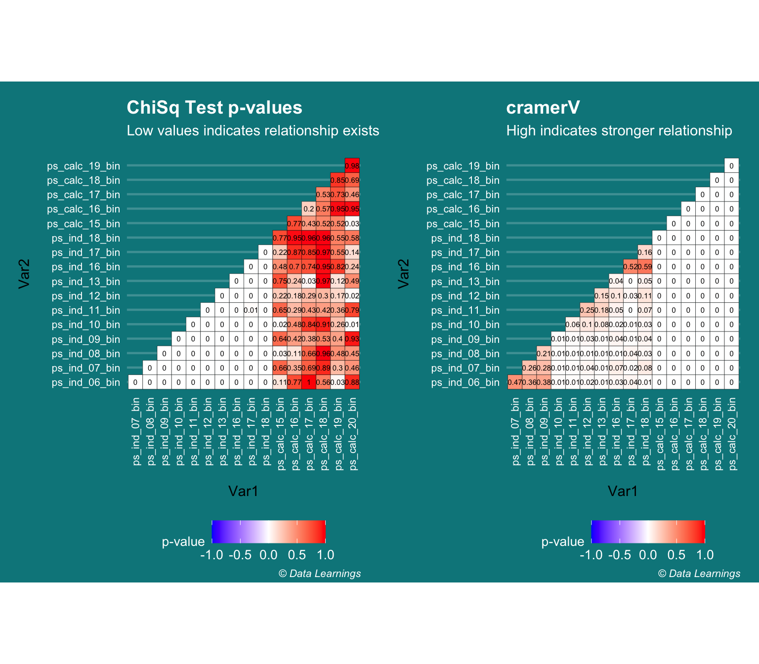
Continuous - Binary (Kruskal-Wallis Rank Sum Test)
- There are multiple ways in which we can test the dependence of Continuous-Categorical variables
- One-way ANOVA
- Logistic Regression
- Point biserial correlation
- Kruskal-Wallis Rank Sum Test
- The Kruskal-Wallis Rank Sum tests is a non-parametric test and hence can be used for non-normal distributions (unlike ANOVA that expects the continuous variable to be normal)
- The Null hypothesis is that the both the variables are dependent
- Hence, a p-value of << 0.05 will reject the null hypothesis
- There are few combinations that result in high p-value but they have low Pearson’s correlation coefficient. Does this mean they are dependent ?
cols_bin <- grep("bin",names(DT_train),value = T)
cols_others <- names(DT_train)[!names(DT_train) %in% c(cols_bin,cols_cat,"id","target")]
grid<- expand.grid(cols_bin,cols_others,stringsAsFactors = F,KEEP.OUT.ATTRS = F)
out_cor <-
map2(.x=grid$Var1,.y=grid$Var2,.f = function(v1,v2){
  cols <- c(v1,v2)
  list(v1,v2,cor(DT_train[,..cols],use="pairwise.complete.obs")[1,2])

})
out_cor <- rbindlist(out_cor) %>% .[order(V3)]
setnames(out_cor,"V3","Correlation")
out_kruskal <-map2(.x=grid$Var1,.y=grid$Var2,.f = function(v1,v2){
  cols <- c(v1,v2)
  k <- kruskal.test(x=DT_train[[v2]],g=DT_train[[v1]])
  list(v1,v2,statistic=k$statistic,pvalue=round(k$p.value,10))

})
out_kruskal <- rbindlist(out_kruskal) %>% .[order(-pvalue)]
setnames(out_kruskal,"statistic","KW - Statistic")
out <- batchtools::ijoin(out_cor,out_kruskal,by=c("V1","V2"))

out[order(-pvalue)][1:10] %>% fn_kable(position = "float_left",caption = "Top 10 p-value")| V1 | V2 | Correlation | KW - Statistic | pvalue |
|---|---|---|---|---|
| ps_calc_20_bin | ps_reg_03 | 0.0002519 | 0.0003591 | 0.9848819 |
| ps_calc_20_bin | ps_calc_11 | -0.0001643 | 0.0005204 | 0.9817993 |
| ps_calc_20_bin | ps_car_15 | 0.0002138 | 0.0005890 | 0.9806376 |
| ps_calc_15_bin | ps_calc_02 | 0.0000345 | 0.0007271 | 0.9784874 |
| ps_calc_18_bin | ps_reg_03 | 0.0002220 | 0.0007388 | 0.9783160 |
| ps_calc_19_bin | ps_calc_05 | 0.0002651 | 0.0015041 | 0.9690632 |
| ps_ind_12_bin | ps_calc_11 | 0.0001290 | 0.0015448 | 0.9686480 |
| ps_ind_09_bin | ps_calc_09 | 0.0000841 | 0.0016159 | 0.9679351 |
| ps_ind_13_bin | ps_calc_11 | -0.0001858 | 0.0016465 | 0.9676327 |
| ps_calc_19_bin | ps_car_12 | -0.0003419 | 0.0021382 | 0.9631184 |
p1 <- ggplot(out,aes(x=Correlation,y=`KW - Statistic`)) +
  geom_point() +
  coord_cartesian(ylim = c(0,11000)) +
  theme_darklightmix(color_theme = ggplot_color_theme,legend_position = "none") +
  labs(subtitle="KW Statistics vs Correlation Coefficient"
  ,caption = varPlotCaption)

p2 <- ggplot(out,aes(x=Correlation,y=pvalue)) +
  geom_point(position = "jitter") +
  theme_darklightmix(color_theme = ggplot_color_theme,legend_position = "none") +
  labs(subtitle="pValue of KW vs Correlation Coefficient"
  ,caption = varPlotCaption)

gridExtra::grid.arrange(p1, p2, ncol=2)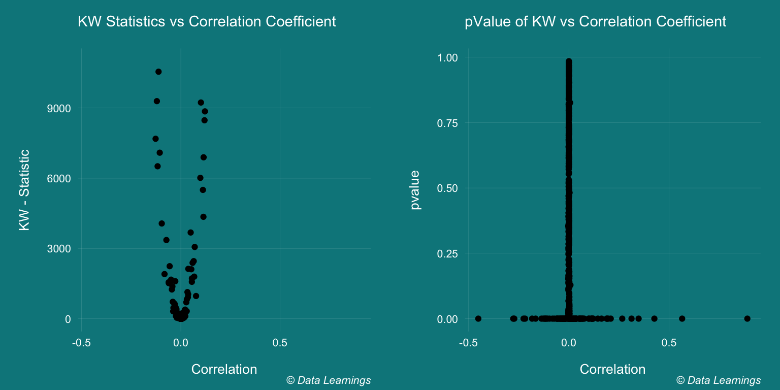
This post has already crossed a 10 mins read, so I will stop here and write another post to continue with the EDA.
Summary / Key Learnings
- The features in the dataset were encoded and their meanings were not provided. Hence, I have not attempted to write how the insights relate to the real-world business
- The objective was to run through the R code and further my understanding of key statistical concepts
- New packages and functions that I learnt while writing this post
na.toolspackage for basic missing value imputation- In the histogram plot, I used the special variable
..count..to show the count of the respective features- As per the documentation, these are special variables computed from the aesthetics
- Alternative way of using them is by calling them within the
ggplot2::stat(count)function ggplot(aes(x=value,y=..count../1e3,fill=variable))
- Ran the Shapiro-Wilk
shapiro.testand Kolmogorov-Smirnovks.testtests for normality- Shapiro-Wilk test works for sample size < 5000
- Both tests expect the distribution to be perfectly normal
- The results of Pearson’s correlation
corwere not different from the results of some other tests- Phi coefficient is used for binary-binary variables
psych::phi(table(x,y)) - Kruskal test is used for categorical-continuous variables, but I was not able to come to conclusion and will need further reading
- Phi coefficient is used for binary-binary variables
- References/Further Reading
### Low variance features
This was an quick overview of the feature set. Next step is to see how these features are correlated.

But before that, I will remove the features that show low variance. For example the `ps_ind_10_bin` has only 0 values and it will not have much predictive value. We can use the `var` function is R to find these features, but it is always a good practice to look at the plots.
DT_train[,lapply(.SD,var)] %>% melt() %>% .[order(value)] %>% .[1:10] %>%
kable(format.args = list(decimal.mark = '.', big.mark = ",")) %>%
kable_styling(bootstrap_options = "condensed"
,full_width = FALSE
,position = "left"
,font_size = 10)
lowVarianceFeatures <- c("ps_ind_10_bin","ps_ind_13_bin","ps_ind_11_bin","ps_car_10_cat","ps_ind_12_bin")
DT_train[,(lowVarianceFeatures) := NULL]
#Bin-Bin
cor(DT_train$ps_ind_18_bin,DT_train$ps_calc_15_bin)
CramerV(factor(DT_train$ps_ind_18_bin),factor(DT_train$ps_calc_15_bin))
Phi(DT_train$ps_ind_18_bin,DT_train$ps_calc_15_bin)
#Bin-Continuous
cor(DT_train$ps_ind_18_bin,DT_train$ps_calc_14)
summary(aov(ps_calc_14~ps_ind_18_bin,data=DT_train))
var(DT_train$ps_calc_14)
aggregate(formula = ps_calc_14~ps_ind_18_bin,data=DT_train, FUN = var)
kruskal.test(DT_train$ps_calc_14,DT_train$ps_ind_18_bin)
#Cat-Continuous
cor(DT_train$ps_car_02_cat,DT_train$ps_car_13,use="pairwise.complete.obs")
summary(aov(ps_car_13~ps_car_02_cat,data=DT_train))
var(DT_train$ps_car_13)
aggregate(formula = ps_car_13~ps_car_02_cat,data=DT_train, FUN = var)
K <- kruskal.test(DT_train$ps_car_13,DT_train$ps_car_02_cat)
cols_bin <- grep("bin",names(DT_train),value = T)
cols_cat <- grep("cat",names(DT_train),value = T)
cols_others <- names(DT_train)[!names(DT_train) %in% c(cols_bin,cols_cat,"id","target")]
cols_bin <- grep("bin",names(DT_train),value = T)
correl <- cor(DT_train[,..cols_bin])
ggcorrplot::ggcorrplot(correl, hc.order = FALSE, type = "lower",lab=TRUE,lab_size = 2) +
ggtitle("bin cor")
cols_cat <- grep("cat",names(DT_train),value = T)
correl <- cor(DT_train[,..cols_cat] )
ggcorrplot::ggcorrplot(correl, hc.order = FALSE, type = "lower",lab=TRUE,lab_size = 2) +
ggtitle("cat cor")
cols_others <- names(DT_train)[!names(DT_train) %in% c(cols_bin,cols_cat,"id","target")]
cols_others <- c(cols_others,"ps_car_11_cat")
correl <- cor(DT_train[,..cols_others],use = "complete.obs")
ggcorrplot::ggcorrplot(correl, hc.order = FALSE, type = "lower",lab=TRUE,lab_size = 2) +
ggtitle("others cor")